The location Goldilocks zone
The best distance from what matters is rarely the closest or furthest. A personal Goldilocks zone turns distance decay into a decision about where benefits peak, costs begin and the relationship becomes irrelevant.

Chris
Founder
Goldilocks is famous for rejecting porridge that is too hot or too cold before finding the bowl that is “just right”. The phrase has travelled well beyond the fairy tale. In astronomy, the Goldilocks zone describes the band around a star where conditions may be suitable for liquid water: not so close that water boils away, and not so far that it freezes.
NASA treats the habitable zone as a useful starting point, not a guarantee of life. Its location depends on the star's size and brightness, and a planet can still be unsuitable for many other reasons. That qualification is important when the metaphor moves onto a property map. A Goldilocks zone is not a universal ring of goodness. It is a defined relationship between a place, a person and the thing they care about.
The useful distance is often in the middle
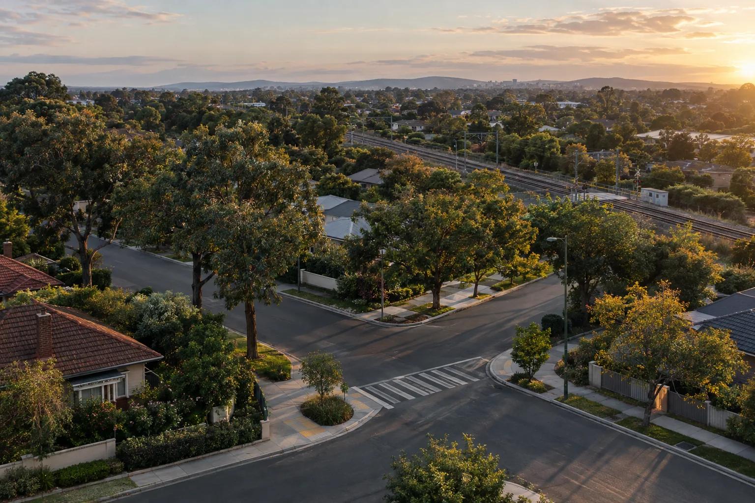
A familiar property question is “How close is it to the station?” The instinct behind the question is sound. A station can shorten a commute, make a trip possible without a car and support a more walkable routine. But the closest address may also sit beside train noise, announcements, vibration, crowds, bus movements, pick-up activity, crossing delays and the lights that come with a transport hub.
Further away, those costs may reduce while the access benefit remains. Further still, the relationship can disappear: a walk becomes inconvenient, a bus or car is needed, and the station no longer changes the household's daily choices. The “right” location may therefore sit between the station edge and the point where access stops being useful. That is a Goldilocks problem.
Distance decay is a starting point, not a verdict
In geography, distance decay describes the tendency for interaction or influence between places to weaken as separation increases. Nearby things are often more related than distant things, but the curve depends on the relationship being measured. A station's practical usefulness may decline with distance. Noise may be strongest at the edge and reduce as you move away. A scenic outlook may improve with distance from a busy road until the view or access is lost.
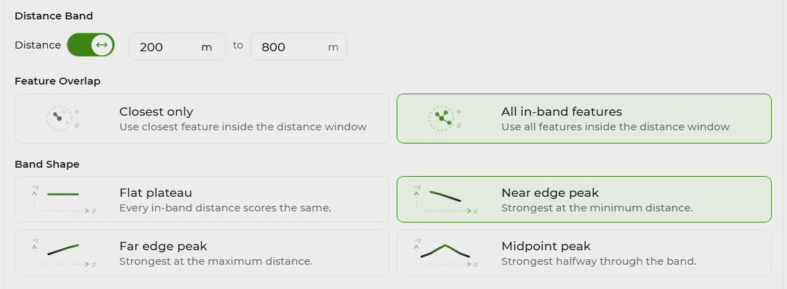
This is why “closer is better” is an incomplete scoring rule. Distance decay needs a shape, a direction and an end point. Does the score rise as distance increases? Does it fall? Is there a preferred interval? Should the score stop at a threshold rather than continue as a tiny positive number forever? The answer belongs to the relationship and the decision, not to distance alone.
Different relationships need different distance bands
| Location pattern | Potential upside | Potential trade-off |
|---|---|---|
| Access benefit | A shorter trip to a station, shop or park may make a routine easier and reduce reliance on a car. | The benefit may flatten once the place is already convenient enough; every extra metre closer does not necessarily improve the day. |
| Immediate interface cost | A little separation from rail, traffic or a busy venue can preserve access while reducing noise, lights and movement at the boundary. | A generic radius cannot tell you whether the relevant effect travels by road, rail, footpath, topography or operating hours. |
| Preferred interval | A middle band can express “near enough to use, far enough to live comfortably” more honestly than a binary inside/outside flag. | The interval is personal and needs a reason; another household may prefer the station edge or reject the area entirely. |
| Outer threshold | A hard limit can stop distant locations receiving a residual score when the relationship is no longer meaningful. | The threshold should reflect the actual routine and route, not a convenient round number copied from a generic report. |
| Opposing relationships | Separate scores can show how access and quiet pull in different directions around the same feature. | One combined proximity score can hide the trade-off and make a location look better simply because competing effects were averaged away. |
Take the train station example seriously
Imagine a household that wants to walk to a train station several times a week but does not want to live on the station boundary. The inner band might score poorly because of rail noise, vibration, announcements, pedestrian movement, buses and traffic. A middle band might score highly because the walk remains practical while the immediate interface is less intense. Beyond 2 kilometres, this household might decide there is no discernible station benefit and assign no score at all.
That 2-kilometre limit is not a fact about every station or every buyer. The route could be hilly, shaded, unsafe to cross, pleasant, direct or poorly connected. A parent with a pram, an older person, a shift worker and a commuter who cycles will not experience the same distance. The important choice is to make the household's threshold explicit rather than allowing a generic proximity badge to speak for everyone.
The rail relationship also needs more than a straight-line measurement. Noise can follow a corridor, a road can funnel buses and cars, and the station entrance may sit on a different street from the tracks. NSW guidance on rail corridors and transport noise exists because the practical relationship includes noise, vibration, access and building context, not only a circle drawn around a point.
Build the zone around the relationship
Kaveat's distance bands are designed for this kind of personalisation. You can define the feature that matters, decide whether closeness is a benefit or a burden, choose the distance at which the relationship is strongest, and set where it should fade or stop. The same structure can be used for a school, park, shopping centre, major road, coastline, industrial edge or a friend's home.
- Name the relationship: access, quiet, separation, visibility, convenience or something else.
- Describe the too-close condition: noise, crowds, traffic, risk, loss of privacy or another cost.
- Choose the useful band: the distance that supports the routine without creating the unwanted interface.
- Set the outer threshold: the point beyond which the feature should contribute no score for this decision.
- Check the measurement: straight-line distance, route distance, travel time or a corridor-specific relationship may each tell a different story.
Why generic proximity scores miss the Goldilocks zone
A portal may show that a property is within a kilometre of a station. That can be a useful clue, but it does not tell you whether the home is beside the tracks, on the quiet side of a station, uphill from the entrance, across a difficult road or connected by a route you would actually use. It also cannot know whether the household wants the station at all, or whether the benefit ends at 800 metres or 2 kilometres.
The promise of a personalised zone is not false precision. It is the opposite: the assumptions are visible. You can say why a band exists, which side of the curve matters and why a distant location receives zero rather than a faint residual score. If the assumptions change, the location model can change with them.
The best distance is not the shortest distance. It is the distance that fits the relationship.
Goldilocks zones are therefore less about finding one perfect radius and more about refusing a lazy rule. The right band for a station may be wrong for a school. The right band for a park may be wrong for a freight route. Kaveat gives you a way to make those differences explicit, compare them across candidate places and keep the final decision connected to the life you are trying to build.